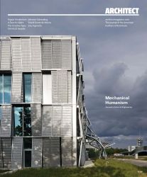
Architect Magazine - Mechanics Hall
Halle mécanique, EPFL, Lausanne
The Journal of the American Institute of Architects
Août 2016. Texts de Nate Berg

Like the work happening inside it, the new building for the mechanical engineering department at the École Polytechnique Fédérale de Lausanne (EPFL) in Switzerland is a study in movement. Its façade of metal mesh is articulated in offset accordion folds, like the tumbling blocks of a Jacob’s ladder toy caught mid-fall. Designed by Paris-based Dominique Perrault
Architecture (DPA), the building seems on the verge of straightening out its hinges and standing up, or, perhaps, slinking down into a flatpack origami fold.
The 223,000-square-foot building behind the façade is a relatively simple collection of offices and labs arranged around a central atrium. But when the building’s automated climate control systems kick in, the façade comes to life as its slanted mesh panels slide to the sides, selectively opening perimeter offices to the sun. For all this metal, it’s surprisingly light, and strays
far from the dark, panelized 1970s building it replaced.
The building is part of an effort at EPFL to break from the aesthetic guidelines laid out in a master plan from the 1970s, resulting in a growing assemblage of contemporary architecture. Across from the new mechanical engineering building sits the Rolex Learning Center by the Japanese firm SANAA, laying across 5 acres of the campus and perforated with holes like concrete Swiss cheese. On the other side of a plaza is a narrow, canoe-like building more than 800 feet long designed by Kengo Kuma and Associates, which is set to open this fall. DPA has contributed two other buildings to this collection, a renovation of an old library into an administration building, with vertical bands of color striping its otherwise shiny black façade; the firm’s forthcoming Teaching Bridge has yet to break ground. These new buildings, says Perrault, HON. FAIA, (who is himself a professor at EPFL), are creating more of an urban feel on the campus by emphasizing their ground floor access and orientation to one another. “We have a natural relationship between the buildings and the public space and the space around,” he says. “It’s more smooth. It’s more comfortable.”
That the new Mechanics Hall works as well as it does in the assemblage has as much to do with how the new building relates to the site as it does with how it responds to the pre-existing buildings. In fact, it connects directly with one of these older structures— which shares the modularized porthole-window and metal-panel motif that typifies the existing campus buildings—through walkways on each of the four floors. In what he calls “a special geometrical echo” of the 1970s vision for the campus, Perrault’s design uses the dimensions of the older building’s cast-aluminum panels, flipped vertically instead of horizontally, for the pieces of his own automated façade.
The factory-built steel-framed façade panels are covered with aluminum mesh and lined up in sets of three, with each set slanted away from the building at alternately its top or bottom. Two of the panels in each set can move along a track to slide behind the third, which is stationary. Wh en they’re opened—either by the building’s climate control system or manually by the building’s users—plentiful light is admitted.
Natural light was important to Perrault’s design, in part because the building itself is so big, measuring 197 feet by 236 feet . To ensure that natural light penetrates into the cavernous floor area, the design emphasizes fl oor-to-ceiling windows on three of its perimeter walls, white and gray interiors , and large skylights over a spacious atrium that sits at the center of the scores of enclosed offi ces and labs. “You don’t feel the deepness of the building,” Perrault says, and the light that filters into the atrium creates an ambiance that he calls “a little bit cinematographic.”
He considers the atrium the center or brain of the building—both for that ambiance and for its programmatic uses. Much of the space is an open void, allowing light from the skylights to spread through the building. But each level above the ground floor has bridges and patio-like outcroppings with seating and tables that project into the center, creating places which the building’s scientists and engineers can use as informal meeting rooms.
But it’s more than just a gathering space. The atrium also provides a very public system of circulation. Two staircases connect each fl oor, and though their nonorthogonal orientation appears somewhat haphazard, one set proceeds more-or-less directly from the fi rst fl oor to the fourth fl oor in a diagonal line. The second set provides a tangled route, requiring one to walk a ways along the balconies on each level to reach the stair to the next. Perrault wanted to provide a variety of options, and he argues there’s value to having many ways to move throughout the space.
In fact, the atrium and its encouragement of movement, whether circuitous or direct, throughout the structure is key to what Perrault hopes the building will accomplish: that the way the scientists and engineers walk around the space will organically engender more interaction between them. The gathering spaces within the atrium, be they formal or informal, become places for scientists and researchers to get out of their labs, converse, and potentially spark collaboration on research or projects. Perrault is hopeful those interactions will lead to new ideas and better science. “Th is space is a sharing place,” he says, “and that is the most important concept and statement about this building.”